One Game, Every Screen
You wrote the game once. This chapter is about the last honest mile of “runs everywhere”: making one set of coordinates look right on a 27-inch monitor and a phone in portrait, keeping input fair across finger and mouse, and putting the same file on iOS as a native app.
The two layout postures, revisited
Chapter 5 named them; here is how to choose. Reflow (positions computed from the live w/h) suits games whose board is the screen: Star Catch, the party duel, most puzzles. Fixed stage suits games whose balance depends on exact geometry: the shmup’s 320×240 arena, where “enemies enter at y = −16” is a gameplay fact that must not depend on the player’s monitor.
Reflow needs no machinery beyond onResize. Fixed stage needs the rig this chapter builds.
The fixed-stage rig
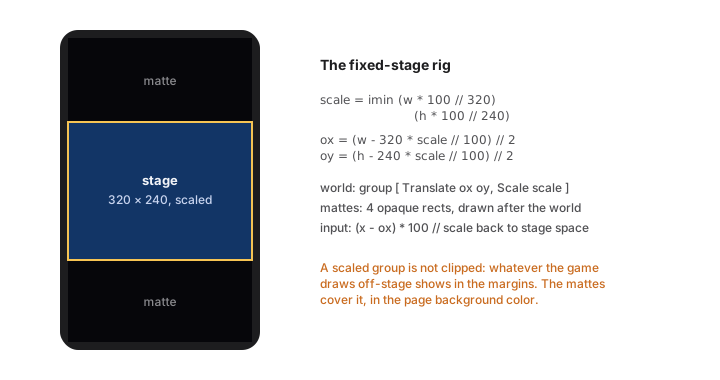
Three pieces, in order. First, compute the fit (integer math, percent scale):
gameW : Int
gameW = 320

gameH : Int
gameH = 240


layout : Model -> { scale : Int, ox : Int, oy : Int }
layout model =
    let
        scale = imin (model.w * 100 // gameW) (model.h * 100 // gameH)
        pw = gameW * scale // 100
        ph = gameH * scale // 100
    in
    { scale = scale
    , ox = (model.w - pw) // 2
    , oy = (model.h - ph) // 2
    }
Second, draw the world inside one transformed group, then the HUD, then the mattes:
view model =
    let
        lay = layout model
    in
    canvas Pixelated [ onResize Resized, onTap Tapped ]
        (List.concat
            [ [ rect 0 0 model.w model.h pageBg ]
            , [ group [ Canvas.Translate lay.ox lay.oy, Canvas.Scale lay.scale ]
                  (stage model)                          -- the whole game, in 320×240 space
              ]
            , mattes model lay                            -- cover the margins, AFTER the world
            ])


mattes : Model -> { scale : Int, ox : Int, oy : Int } -> List Shape
mattes model lay =
    let
        pw = gameW * lay.scale // 100
        ph = gameH * lay.scale // 100
    in
    [ rect 0 0 model.w (imax 0 lay.oy) pageBg
    , rect 0 (lay.oy + ph) model.w (imax 0 (model.h - lay.oy - ph)) pageBg
    , rect 0 0 (imax 0 lay.ox) model.h pageBg
    , rect (lay.ox + pw) 0 (imax 0 (model.w - lay.ox - pw)) model.h pageBg
    ]
The mattes are not decoration; they are correctness. A scaled group is not clipped to the stage. Your game constantly draws outside its arena (spawns above the top edge, parallax wrapping past the sides), and on a desktop window that exactly fits, none of it shows, so you will not notice. On a tall phone, the margins expose your backstage. The shmup shipped this lesson: opaque rects over the four margins, drawn after the world, in the page background color, so the stage reads as a framed arcade screen everywhere. If you letterbox, matte.
Third, map input back into stage space, the inverse transform:
toStage : { scale : Int, ox : Int, oy : Int } -> Int -> Int -> { x : Int, y : Int }
toStage lay x y =
    { x = (x - lay.ox) * 100 // imax 1 lay.scale
    , y = (y - lay.oy) * 100 // imax 1 lay.scale
    }
Every tap and drag goes through toStage before the game sees it, and the entire simulation stays innocent of screens.
Phone manners
A grab-bag of facts that make the web build feel intended on phones, all standing on framework behavior you get for free but should know exists:
- Full-bleed canvas. A page whose root is a canvas fills the real viewport, safe areas handled. Keep your HUD a design margin (20-odd stage pixels) away from edges anyway; notches and home indicators overlay the extremes.
- No accidental selection. On game pages the runtime disarms iOS text selection, callouts, and sticky tap highlights, so a frantic player mashing the screen does not summon a magnifying glass mid-boss. You still owe them hold-friendly design: nothing in a game should require a long-press (that is where OS gestures live).
- Hover does not exist here. Restated from chapter 7 because it is the number-one desktop-developer reflex: any affordance shown on hover needs a visible-at-rest version on touch.
- Orientation is a resize. Rotating fires
onResizelike any other size change; reflow games adapt free, fixed-stage games re-letterbox. Decide which orientation your game means and design the other to at least be playable.
iOS, natively
The same project builds a real iOS app:
mar build --target ios
This scaffolds a complete Xcode project into dist/ (configured from an "ios" block in mar.json): open it, press run, and your game is on the simulator or device with the five game modules running natively: SwiftUI-canvas rendering, display-link ticks, the audio-engine synthesizer, GameController gamepads, hardware keyboards.
Development on-device is kinder than you expect: a debug build finds your running mar dev server on the local network (it adopts only a server running the same app name, and shows a banner when connected), so you get hot reload on the phone in your hand. Ship builds embed everything; TestFlight and the App Store take it from there like any Swift app.
What deserves real testing on the device, in order: input feel (thumb sizes, drag thresholds), audio volume against the phone speaker, performance in the busiest scene (chapter 14’s habits), and the letterbox on the tallest current phone. The logic needs no re-testing; that is the whole point of one source of truth.
The parity contract
The reason this chapter is short given what it does: the platform work already happened, in the runtimes, held by conformance tests. Draw lists render the same, integer math agrees to the digit, the same seed shuffles the same deck. “Multiplatform” in Mar is not a porting activity; it is a property you inherit and then respect at the edges (layout, input, volume). Respect it at those three, and the phone build is a checkbox, not a project.